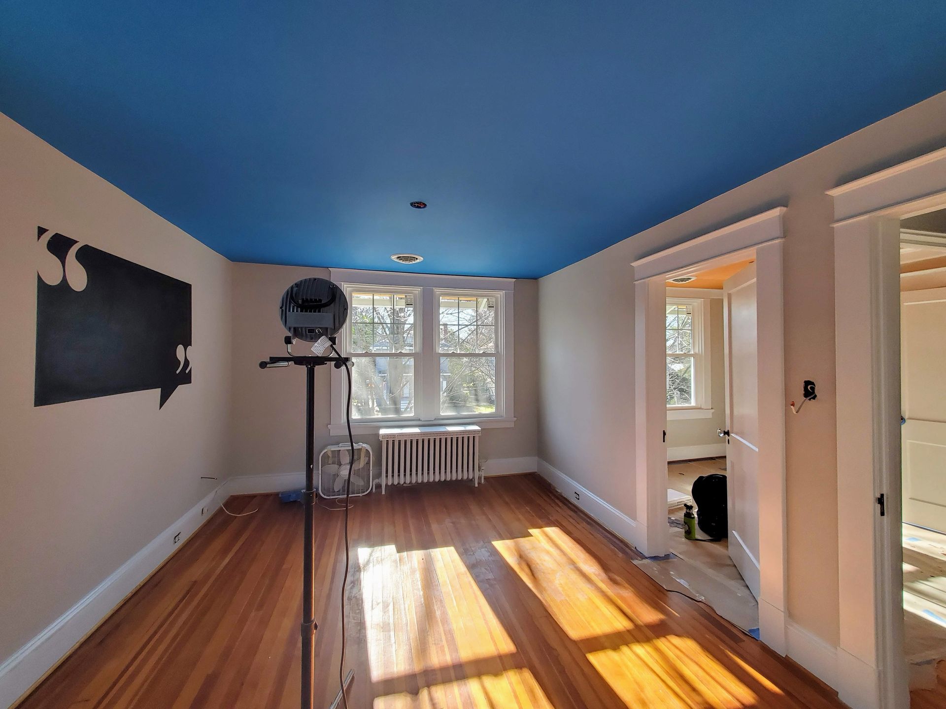
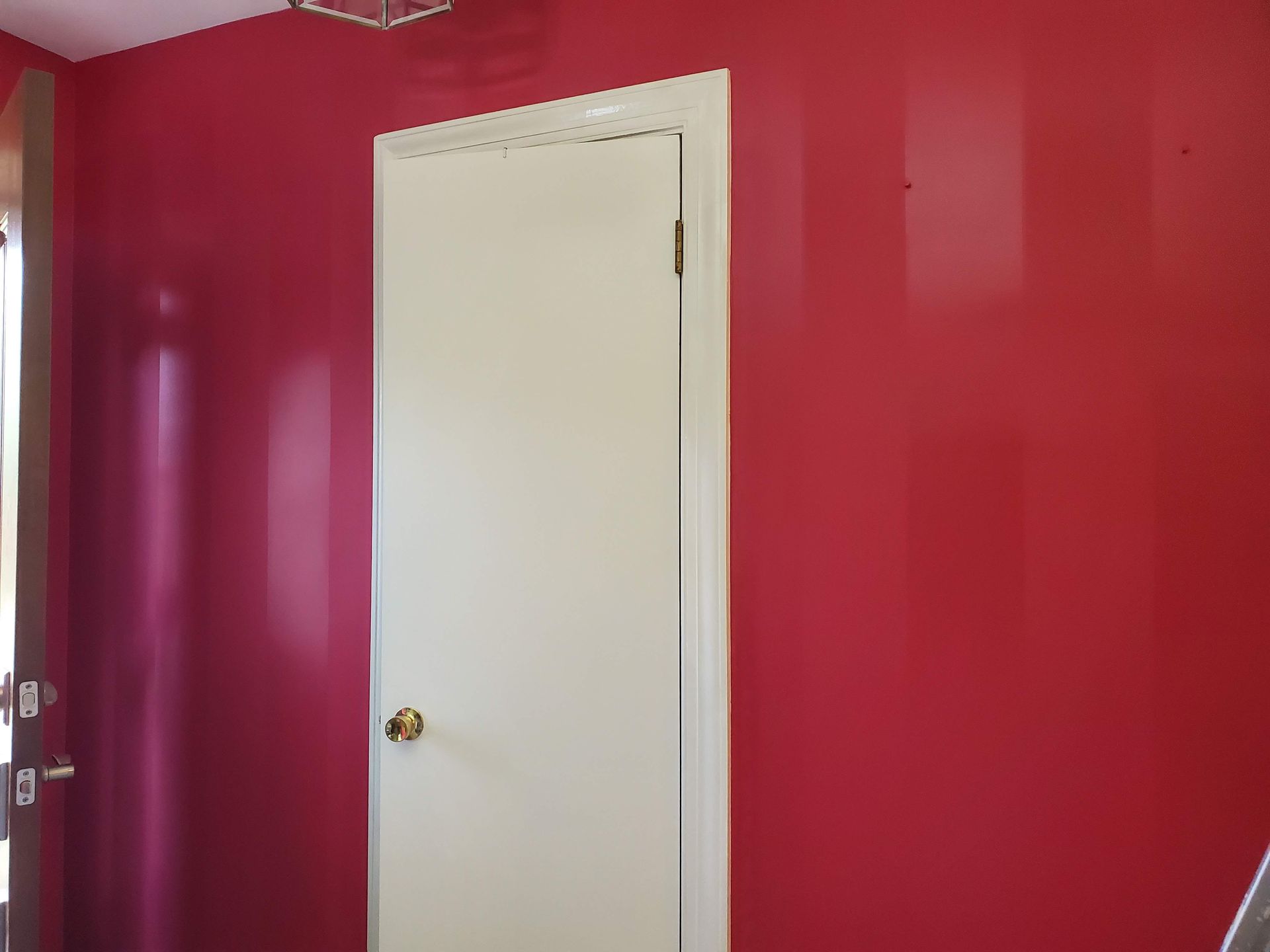
Painting for Every Need: Color & Finish Solutions tailored to Neurodivergence, Accessibility, and Wellness
Interior paint is more than an aesthetic choice—it directly impacts focus, sensory comfort, light sensitivity, and spatial clarity.
Discover how strategic paint finishes, tailored color palettes, and low-VOC materials create calming, accessible, and functional spaces designed specifically for homeowners with visual, sensory, or physical needs.
Photophobia Management
Minimizing triggers through glare elimination & muted palette selection
Migraine sufferers are highly sensitive to light (photophobia) and harsh visual stimuli. Eliminate glare entirely by using ultra-flat or true matte finishes on all walls and ceilings.
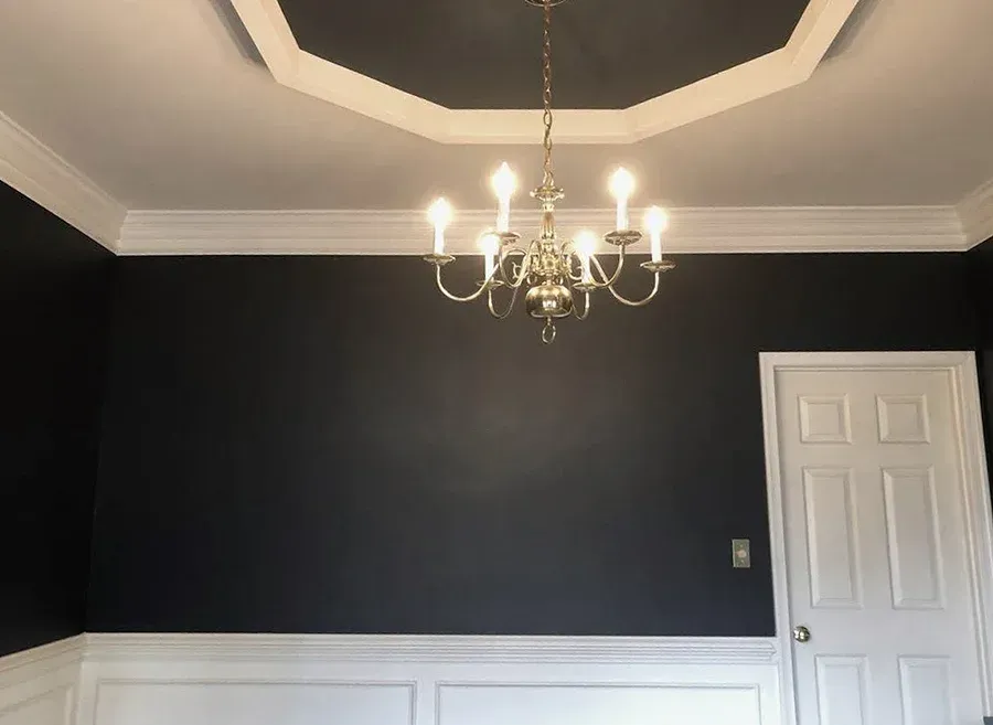
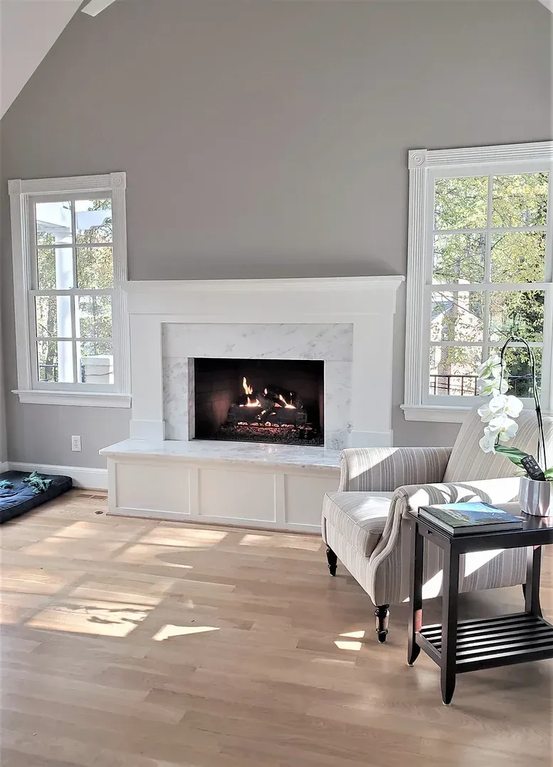
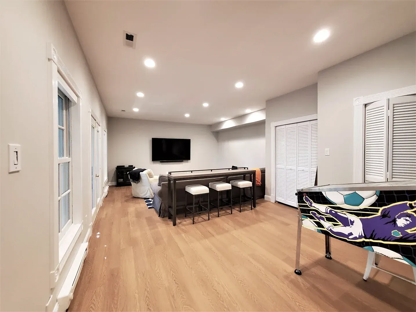
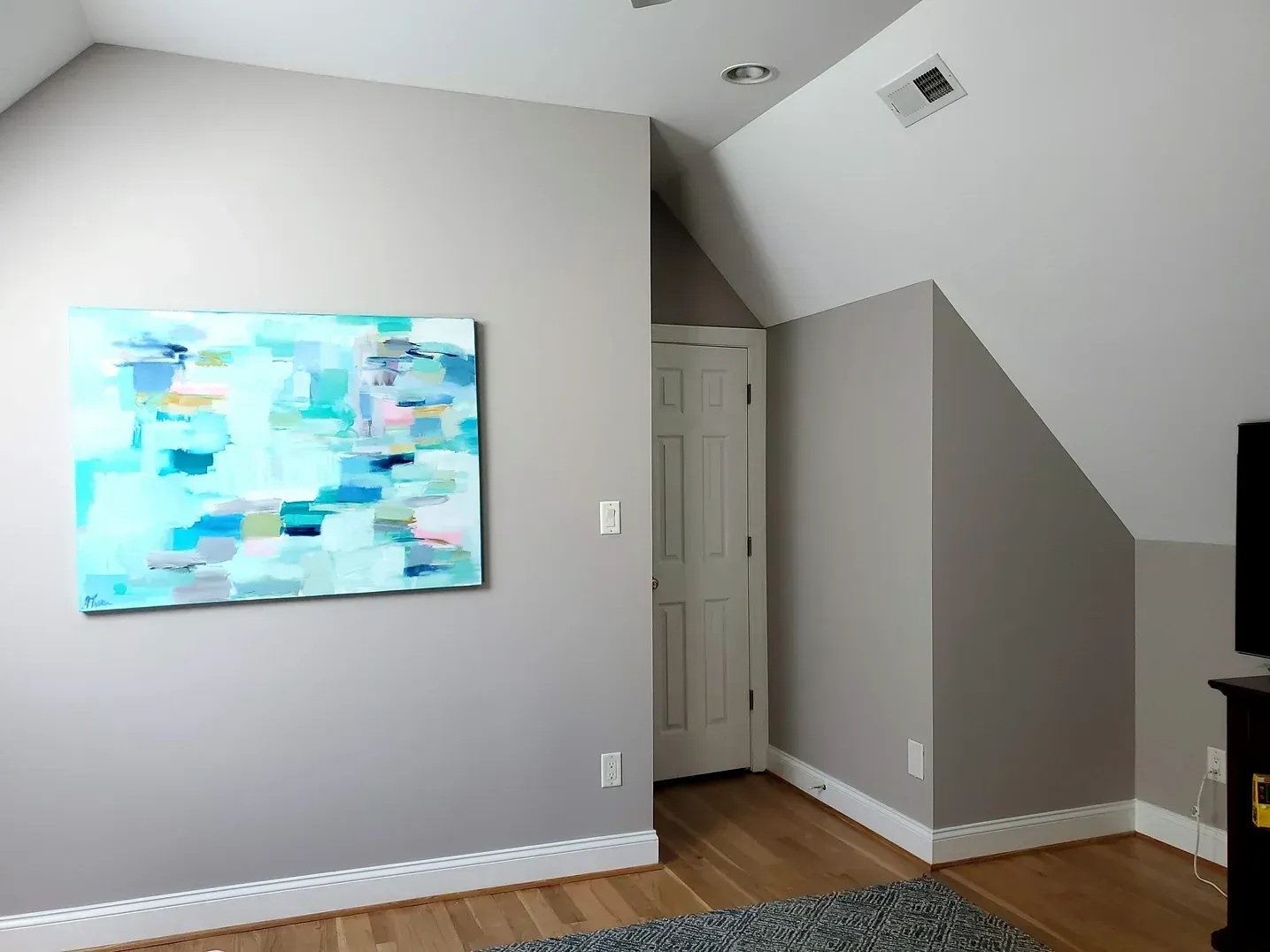
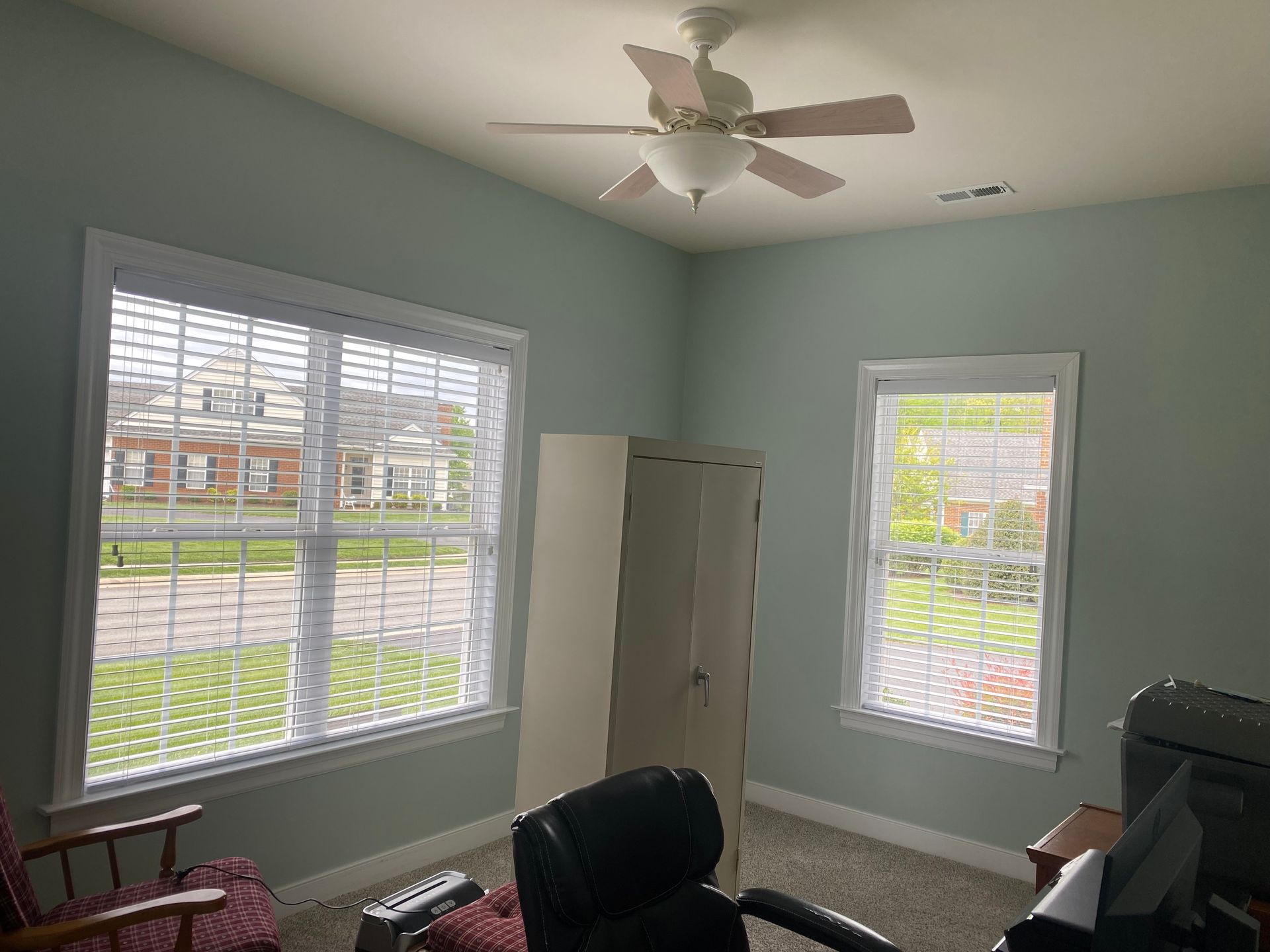
Avoid pure whites, which can reflect light too sharply and trigger pain. Instead, apply muted, cool tones like soft sage, dusty lavender, or charcoal gray. These low-saturation colors absorb excess light and create a visually restful environment.
Supporting Focus & Reducing Cognitive Fatigue
CALMING BASE
Hyperactivity and attention deficits can be exacerbated by visually chaotic environments.
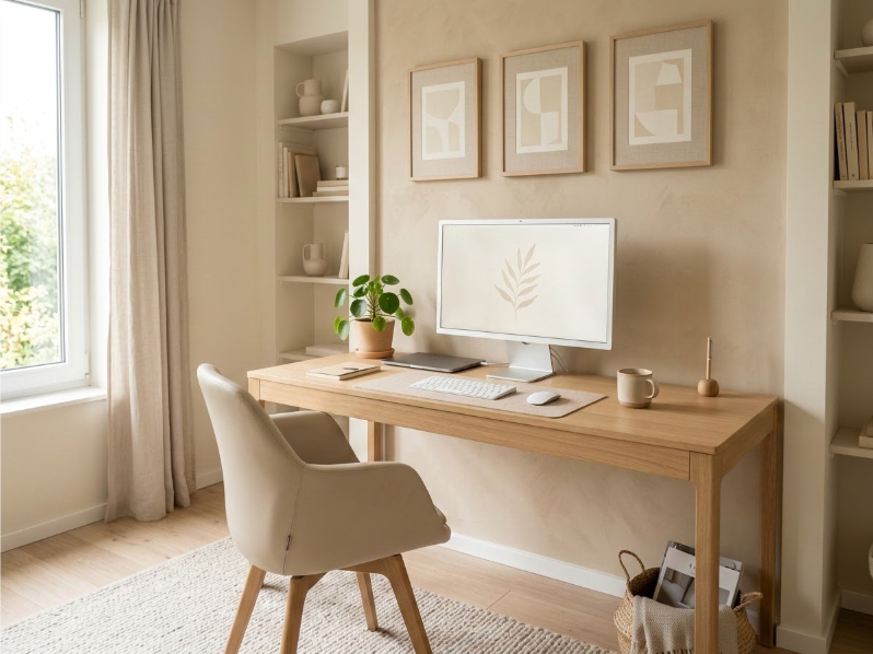
Use low-stimulation, monochromatic color schemes with soft earth tones to create a grounded, calming atmosphere.
STRATEGIC ACCENTS
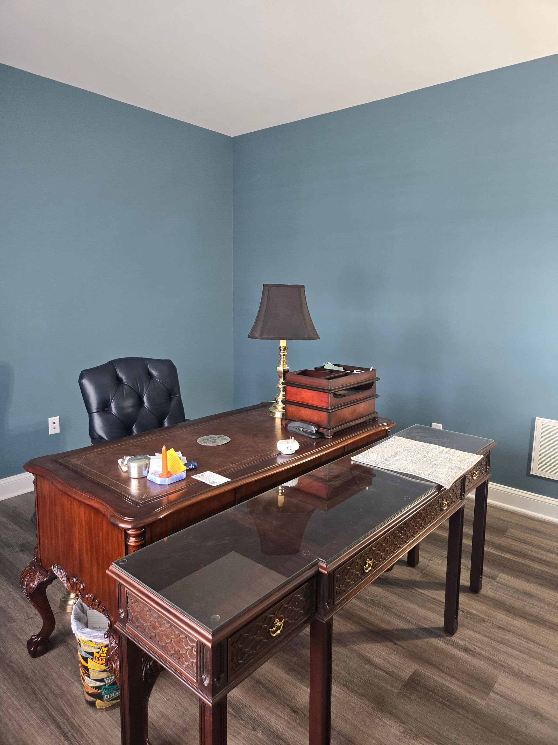
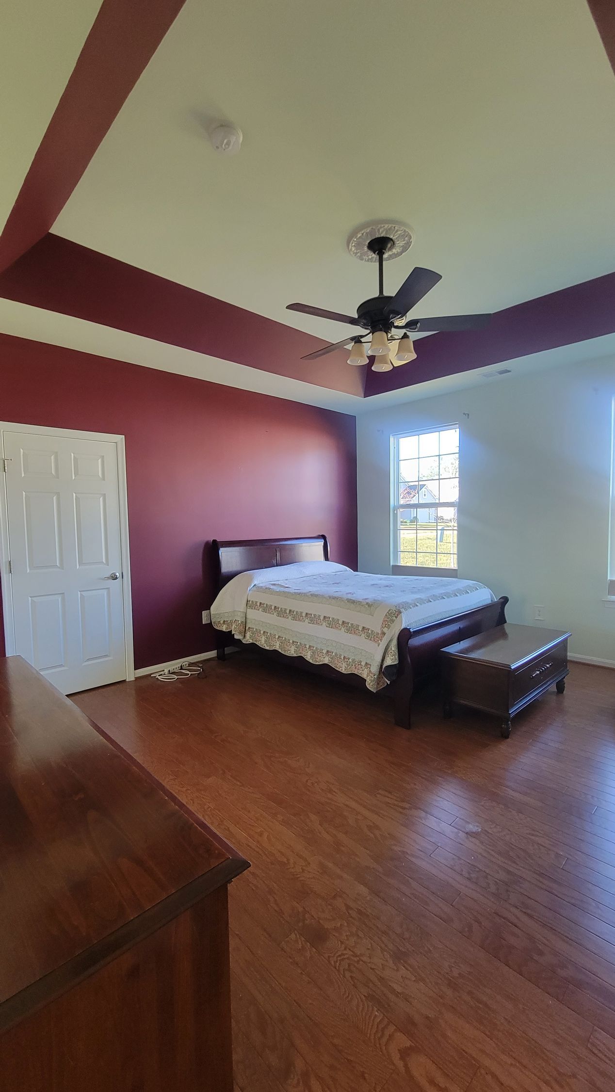
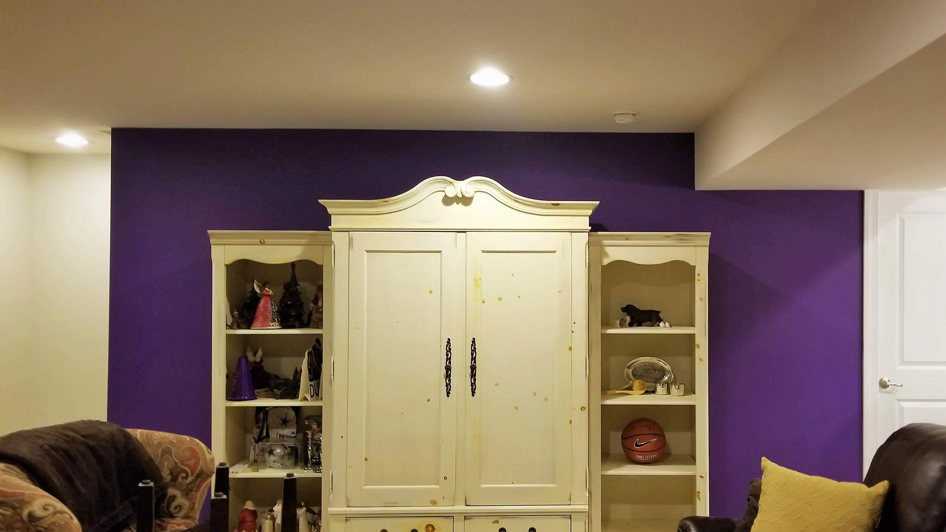
If using accent colors, place them strategically behind the primary line of sight (such as behind a desk or bed) to prevent constant visual distraction.
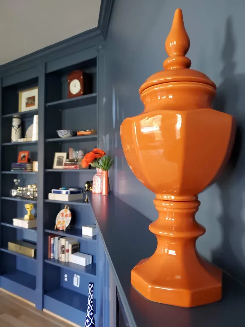
Avoid high-energy colors like bright reds or oranges, which can increase restlessness.
Maximizing Natural Light for Emotional Well-Being
Using high-LRV, uplifting color palettes to foster positive psychological impacts.
LRV 65+
Light Reflective Value
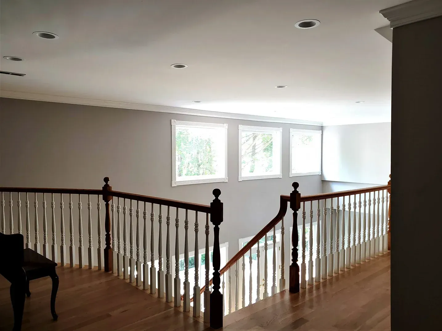
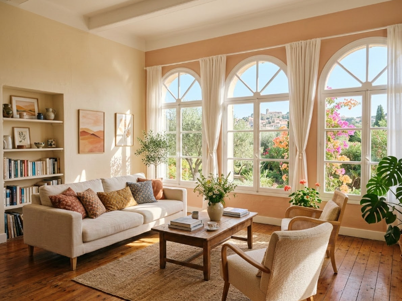
Environmental psychology shows that color and light significantly impact mood. For clients managing depression, use paints with a high Light Reflective Value (LRV of 65 or higher) to bounce natural sunlight deeper into the room.
Opt for soft, uplifting tones like warm yellows, pale terracottas, or light sky blues to create an inviting, open dynamic.
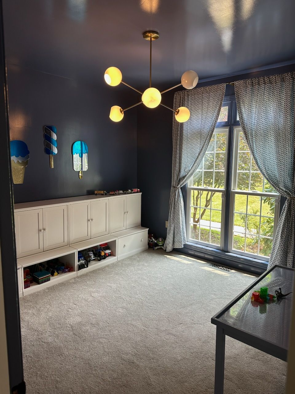
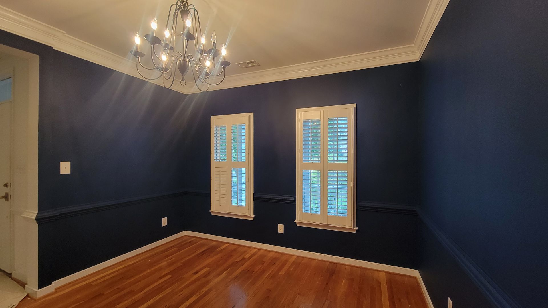
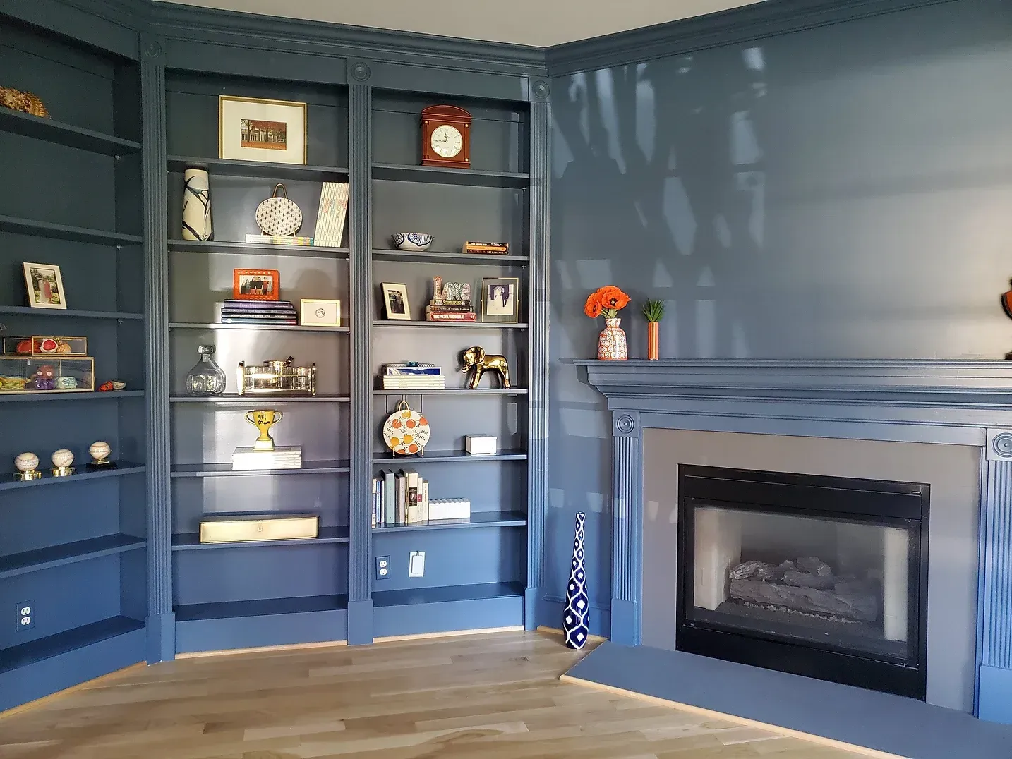
Avoid heavy, dark colors that absorb light and can make spaces feel enclosed or isolating.
Sensory Comfort & Indoor Air Quality
Prioritizing health and well-being with low-VOC, durable, and calming paints
- AIR QUALITY & RESPIRATORY HEALTH
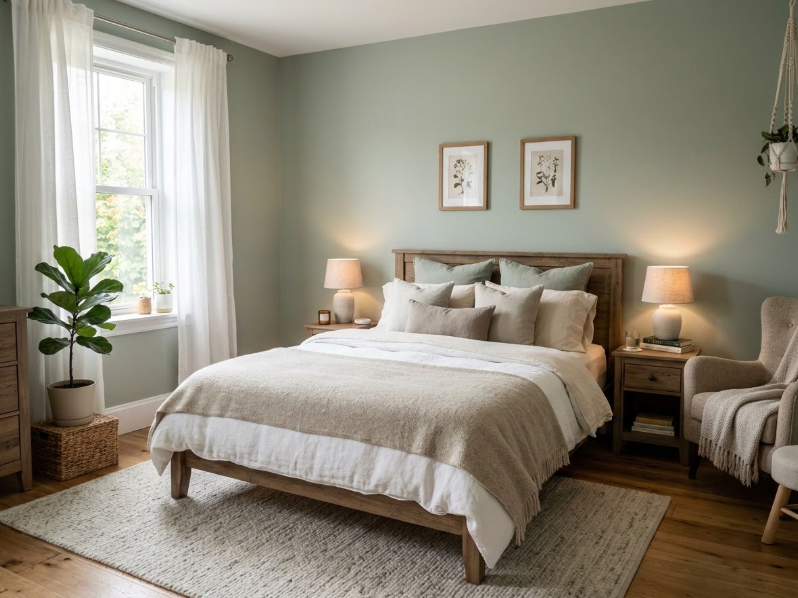
Individuals with Down syndrome often experience sensory sensitivities and compromised respiratory systems. Always use Zero-VOC and GREENGUARD Gold certified paints to ensure optimal indoor air quality.
- SENSORY HARMONY PALETTE
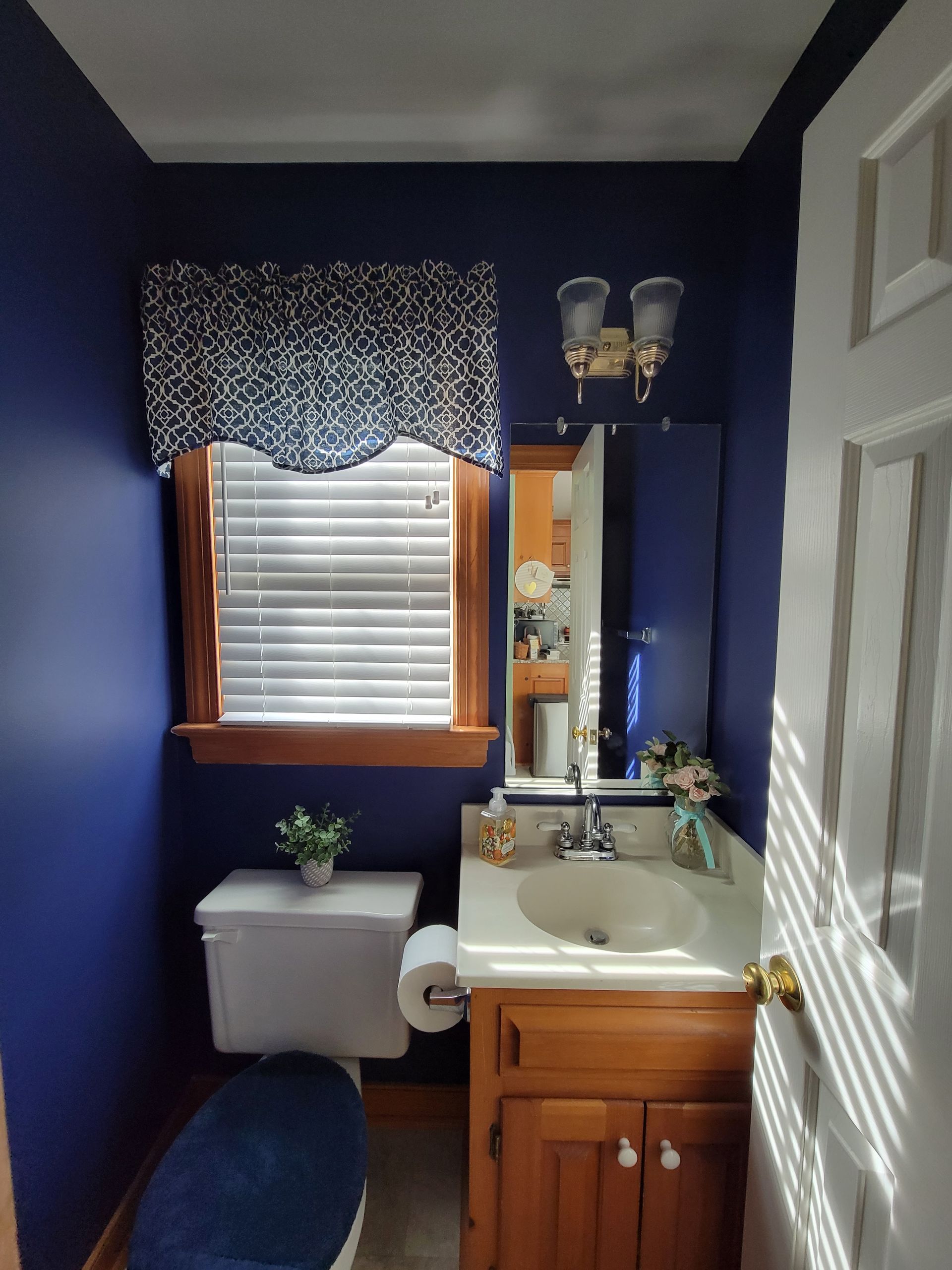
Select calming, muted color palettes—such as soft greens and warm blues—to create a soothing, peaceful environment that actively prevents sensory overload.
- DURABLE & SCRUBBABLE FINISHES
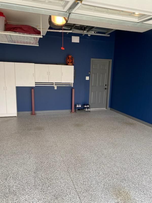
Use highly durable, scrubbable finishes like eggshell or satin in high-traffic areas. This ensures surfaces withstand frequent cleaning without losing color integrity or texture.
Visual Communication & Wall Finishes
Strategic lighting and non-distracting backgrounds for accessible environments
Contrast & Visibility
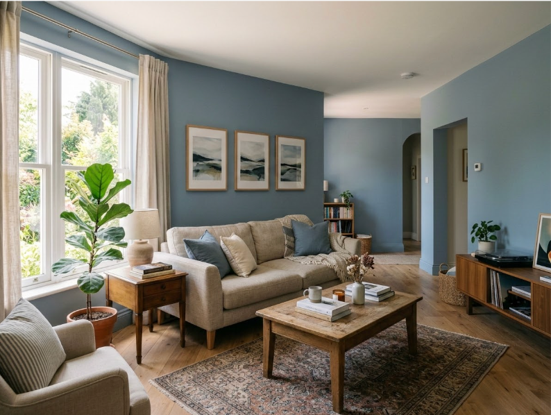
Individuals with hearing loss rely heavily on visual cues and sign language. Paint walls in solid, contrasting colors that help skin tones stand out, reducing eye strain during visual communication.
Glare Reduction
Avoid busy patterns or highly reflective gloss finishes that create distracting glare and increase visual fatigue.
Optimal Finishes
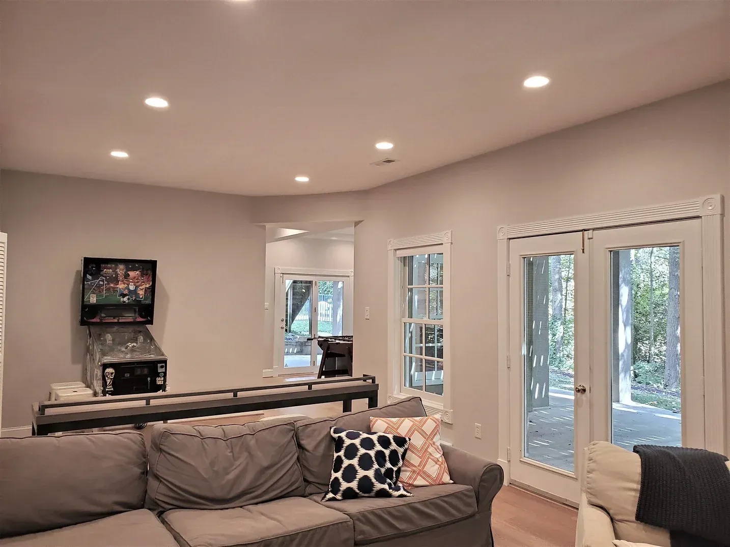
Satin finishes in warm, muted tones provide a comfortable backdrop that enhances natural light without overwhelming the visual field.
Maximizing Spatial Awareness Through Contrast
30-POINT LRV DIFFERENCE
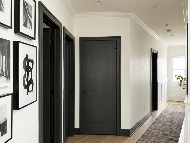
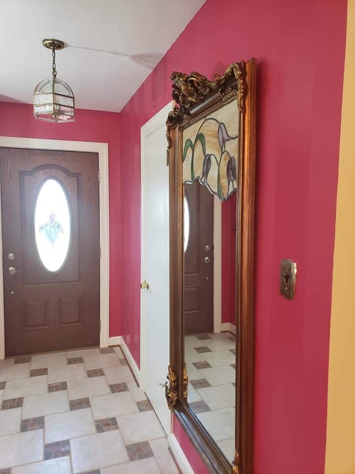
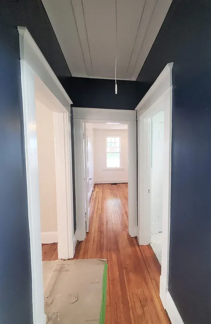
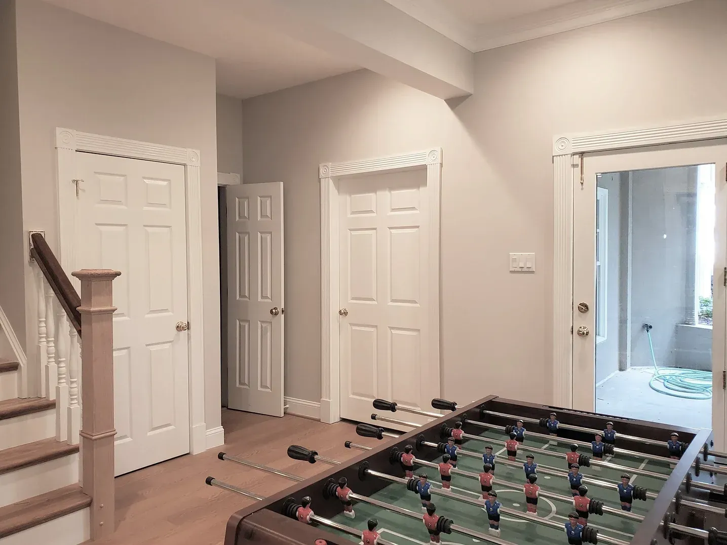
For clients with low vision, visual contrast is critical for safe and independent navigation. Ensure at least a 30-point Light Reflectance Value (LRV) difference between walls, doors, and trim to clearly define spatial boundaries and transitions.
GLARE REDUCTION & TACTILE CUES
Use flat or matte finishes on walls to significantly reduce glare, which can severely obscure depth perception. Additionally, incorporate tactile elements like distinct textured finishes on door frames to provide intuitive physical wayfinding cues.